RIVO AGENCY

Let's create something that matters!
5.0
Let's create something that matters!
5.0

Visit Website

RIVO AGENCY Overview

Contact

Phone: +380 96 424 71 50

Country: Ukraine

City: Rivne

Address: A. Melnyka St., 1

Phone: 3477057935

Country: Estonia

City: Tallinn

Address: Kaupmehe tn 7-120 Kesklinna linnaosa, Tallinn Harju maakond 10114

  • RIVO AGENCY Project's Size

    $5,000 +

  • RIVO AGENCY Number of Employees

    50 - 249

  • RIVO AGENCY Hourly Rate

    $25 - $49 / hr

  • RIVO AGENCY Founded

    Founded 2010

Our company offers the development of various products, from simple promotional sites for individuals or companies to complex solutions for various purposes, for example CRM and ERP systems, scalable web platforms, mobile applications, Internet of Things, etc.

We apply our experience and knowledge to bring your product from concept to prototype and production.

Services of RIVO AGENCY

Programming & Scripting

  • JavaScript

    40%
  • PHP

    40%
  • SQL

    20%

Frameworks and CMS

  • Laravel

    20%
  • NodeJS

    30%
  • ReactJS

    30%
  • WordPress

    20%

Portfolio of RIVO AGENCY
Key clients: Toyota, Skoda, Fleurs de Cafe, Skyline Energy
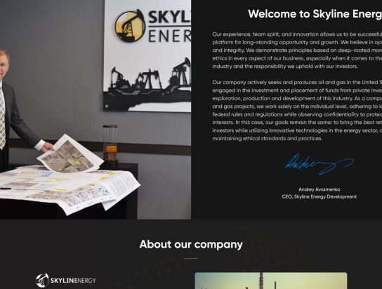
Skyline Energy
Web Development • ReactJS
RIVO AGENCY
MEDA
Web Development • ReactJS
RIVO AGENCY
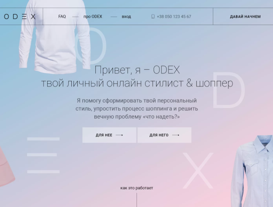
ODEX
Web Development • WordPress
RIVO AGENCY
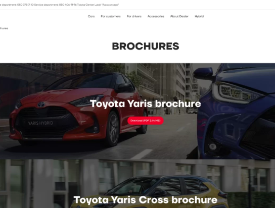
Toyota
Web Development • ReactJS
RIVO AGENCY

Reviews (4)

THE REVIEW

"Saltmine"

Jan 23, 2023

5
  • Quality:

    5
  • Schedule:

    5
  • Cost:

    5
  • Willing to refer:

    5

Feedback summary:

Story behind We love working with interesting businesses. And despite the extensive international experience, we want to improve Ukrainian business as well. Especially the companies with big international ambitions. We love challenging tasks, and we used our experience to digitize this business. As a result, our client received a unique brand story, key features, and design of this website. Such kind of business requires permanent technical support and professional content marketing including search engine optimization, that’s why we have been cooperating with Saltmine for many years. User Story The client needed to create a website that boosted the brand as much as possible showed all the specifics and features of the business, and would be visually attractive to customers and partners. This business is big, so it needed the development of a solution that would have a high quality for the Ukrainian market as well as the international one. It was important for the company to create a website that would show the mission that Saltmine wanted to deliver in the field of health, and at the same time could demonstrate its uniqueness.

THE PROJECT

Saltmine

THE REVIEWER

Manager

THE REVIEW

"Skyline energy"

Jan 23, 2023

5
  • Quality:

    5
  • Schedule:

    5
  • Cost:

    5
  • Willing to refer:

    5

Feedback summary:

Story behind Skyline is an international company that provides qualitative planning of oil extraction places on the territory of the United States of America. The purpose of the leading oil – extracting industry representative was to attract investors for the development of professional activity and international partnerships. The client wanted: Systemize information about the company To show features and benefits of working with his company Choose a design that would emphasize the peculiarity of the company Optimize the site to find new partners and customers User Story The Skyline project was implemented in 2014. This is a digital platform that builds bridges from the independent gas and oil company to its potential investors. The project aims to provide reliable interrelations that will contribute to the exploration of oil and gas properties, planning of oil extraction processes, and other activities of the leading industrial corporation. Our dedicated team created a concept of the website and developed it according to the demands of the Skyline’s top management. Design Our client wanted to stand out from his competitors and make a modern website with flawless UI and UX. So our goal was to create a unique design concept able to emphasize the exclusivity of the client’s business segment. Tech stack Using integrated technologies, we have made a high-quality solution for our client: We have created a user-friendly interface Developed individual design concept Created content that allows customers and partners to appreciate all benefits of the company We showed the uniqueness of the business niche with the help of the site and singled it out among the competitors The site fully performs its marketing function. It is high-speed and converses new partners and customers. The site has high speed and is very useful for new customers. In order to achieve such a result, we have used several technologies. The website had to be dynamic, easy to understand, and manage, so the best decision here was the usage of WordPress. Developing the key features turned our attention to JavaScript along with jQuery to make the view attractive and give a smooth UI along with a nice UX. PHP helped our developers to create and conned various features like email sending and contact forms and in order to store the data we have taken MySQL as the best tool in this regard. Development Our team of developers together with the PM and designer began the building of the project with research work. The ready-done website has the following feature set: WordPress-based multi-siting – this feature allows using only one WordPress installation and one database for an unlimited number of websites; The unique design – one-of-a-kind graphical solutions that harmonize with the concept of the digital platform. Result The project development was finished when the final testing procedures were done. Now, the oil and gas independent company Skyline introduces potential partners and investors to their forms of activities through the qualitative multipurpose website.

THE PROJECT

Skyline Energy

THE REVIEWER

CEO Skyline Energy

THE REVIEW

"Fleurs de cafe"

Jan 23, 2023

5
  • Quality:

    5
  • Schedule:

    5
  • Cost:

    5
  • Willing to refer:

    5

Feedback summary:

Story behind The whole story starts with two young girls from New Jersey, who have a strong passion for two things: flowers and coffee. Irena and Julie are florists, and their desire to explore and share the beauty of flowers with the rest of the world was so strong that they started to collect the most beautiful examples of them. Furthermore, both of them are coffee addicts, and they decided to combine all that passions into one and deliver it to the world. So, that’s how their creative and beautiful flower + coffee shop began its existence. User Story As far as Irena and Julie are highly skilled in floristics, and have tasted numerous sorts of coffee around the world, they have decided to encapsulate their inspiration and experience in a small but promising business. They have selected the best flowers they could that come straight from the best eco-friendly farms in Ecuador, Colombia, and the Netherlands to make the best and long-lasting impressions on the customers. In order not to stay pale and regular, flower shop girls added their passion for coffee and selected the most unique and full of taste and notes examples. The girls wanted their small shop to grow and decided to create an online shop to reach more customers and deliver value to them. They wanted to attract and keep the customers not only with their concept but with fast and high-quality services. For that reason, they wanted to apply the fastest delivery in 15 miles in New Jersey and use USPC delivery to cover the whole USA. They have heard of us and seen our quality of work, so understood that we can help them. Design The main idea of this online shop was to show gentleness. It should reflect the light and gentle nature of flowers and touch every single particle of a soul to give some warmth, comfort, and happiness. Irena and Julie didn’t want something complicated, they wanted to embrace the natural quirks and beauty of the blooms. They wanted flowers to speak for themselves, and coffee set the hearts in a flutter. Everyone who would visit the online shop should have some feeling of comfort and want to stay some more. This shop isn’t about marketing, but about strong feelings. Taking all of that into account, our designer has created a bright, gentle, and simple-to-interact design that won’t overload the eyes and mind and makes customers feel at home there. He has underscored the theme of the shop with pink, coffee with milk, and white colors to reflect the main idea of the shop. Customers were totally enlightened. Development In terms of development, this project wasn’t so hard to create for our team. Our developers have a lot of experience in creating different systems and custom software, so creating a simple but stylish online shop wasn’t a problem at all. The main technology that formed a core for Fleurs de café online shop was WordPress along with WooCommerce plugin for its good optimization and great functionality that fits perfectly for any online shop development. For creating a robust and friendly front end with attractive UI, our developers used ReactJS and jQuery and jQuery UI libraries to make some specific and unique features. Sure thing, our online shop needed a good database to collect and handle that data, and we utilized MySQL for these purposes. As far as the girls wanted to provide the payments with Apple Pay and PayPal and fast delivery of bouquets in the nearest 15 miles in New Jersey and cover all of the USA through USPC delivery, we used all named technologies to implement this functionality. Result In the end, Irena and Julie received the online shop that on one side was gentle, nice and soft and on the other side was powerful, fast, and delivered great UI/UX. As a result, great design and development along with decent products, delivery, and payments have played their role and attracted a lot of customers. Irena and Julie remained satisfied and, the business expanded and continues to grow at the moment.

THE PROJECT

Fleurs de cafe

THE REVIEWER

CEO

THE REVIEW

"Toyota"

Jan 23, 2023

5
  • Quality:

    5
  • Schedule:

    5
  • Cost:

    5
  • Willing to refer:

    5

Feedback summary:

Story behind Since 2007 our “Autoconcept” Toyota Center was selling high-quality cars and providing services for customers from the whole of Ukraine. They worked using a regular marketing approach: banners, radio, TV, and recommendations of satisfied customers. But they wanted to get more clients and understood that they need to set their presence on the Internet. User Story “Autoconcept” LLC received the status of an official service center in December 2007, and a year later, in December 2008, it became an official dealer of TOYOTA cars in the Volyn region. Autoconcept Toyota Center Lutsk auto showroom began to fully function in 2010 and they wanted to get the clients through all the possible channels. As far as all companies get most of their clients through online channels, they have decided to create a website and even did it, but it didn’t look and bring as many customers as our client wanted. On that note, our client decided to redesign and improve the website to make it attractive, beautiful, and easy to understand for everyone who clicked on their link. Design The client wanted to reflect all the beauty, variety, and services that cars possess. In addition, they wanted to show how professional their business is and why people should choose them. The whole structure of a website had to say: “Look at this car, how cool it is! Take a closer look and buy it!” at the same time it shouldn’t be complicated and easy to browse. To complete this request our designer learned more about the model range Toyota and took the best cars from an aesthetic point of view. The forms and colors of those cars were used to reflect the topic of a website and should have drawn the attention of everyone who came to the website. The simple and clear colors and fonts were used to create a contrast and ease of comprehension. The client wanted to use the call to action, so our designer highlighted the necessary actions with the red color to attract the most attention of users. Tech stack The client wanted to make his website rather fast and available for all devices. To achieve that our team of developers has used Bootstrap because it allows us to create responsive layouts faster and easier. In addition to all of that client wanted to have the elements of an online shop so PHP was used. To create dynamic and unique features Vanilla JS and jQuery were used to achieve that. Also, the client wanted to keep his customers in a database so MySQL was a good idea to use. Development The development process was smooth and fast because of two factors: a skilled team and experience in the same kind of project. Our client wanted to implement several features like online consultation booking, online auto selection, sorting and selection of cars according to user’s parameters, ability to order goods and get requests. To meet all the requirements of our client we have used different technologies such as PHP at the back end and JS with jQuery for the front end side. Thanks to the skills of our PM and developers, their experience, and coherent work the project was fulfilled in the estimated period of time with all client’s wishes accomplished. Result As a result, our client received an edge-looking, multi-functional site with the ability to collect, interact and sell cars on the Internet and provide relevant information so the possible customers always knew updates about cars, services, and special offers. We met all the expectations and fulfilled all the wishes to satisfy all client’s needs.

THE PROJECT

Toyota

THE REVIEWER

CEO

Verification of RIVO AGENCY
Client Reviews
VERIFIED CLIENT REVIEWS
4
OVERALL REVIEW RATING
5.0
Image ALT-text

Check You Company Bio

We strive to be accurate in everything. If you notice a mistake about your company bio or some mismatch in our catalog, please, let us know! You can edit the bio yourself or write one from scratch!
Join Our Catalog